MoneyPort — Cross-Border B2B Payments
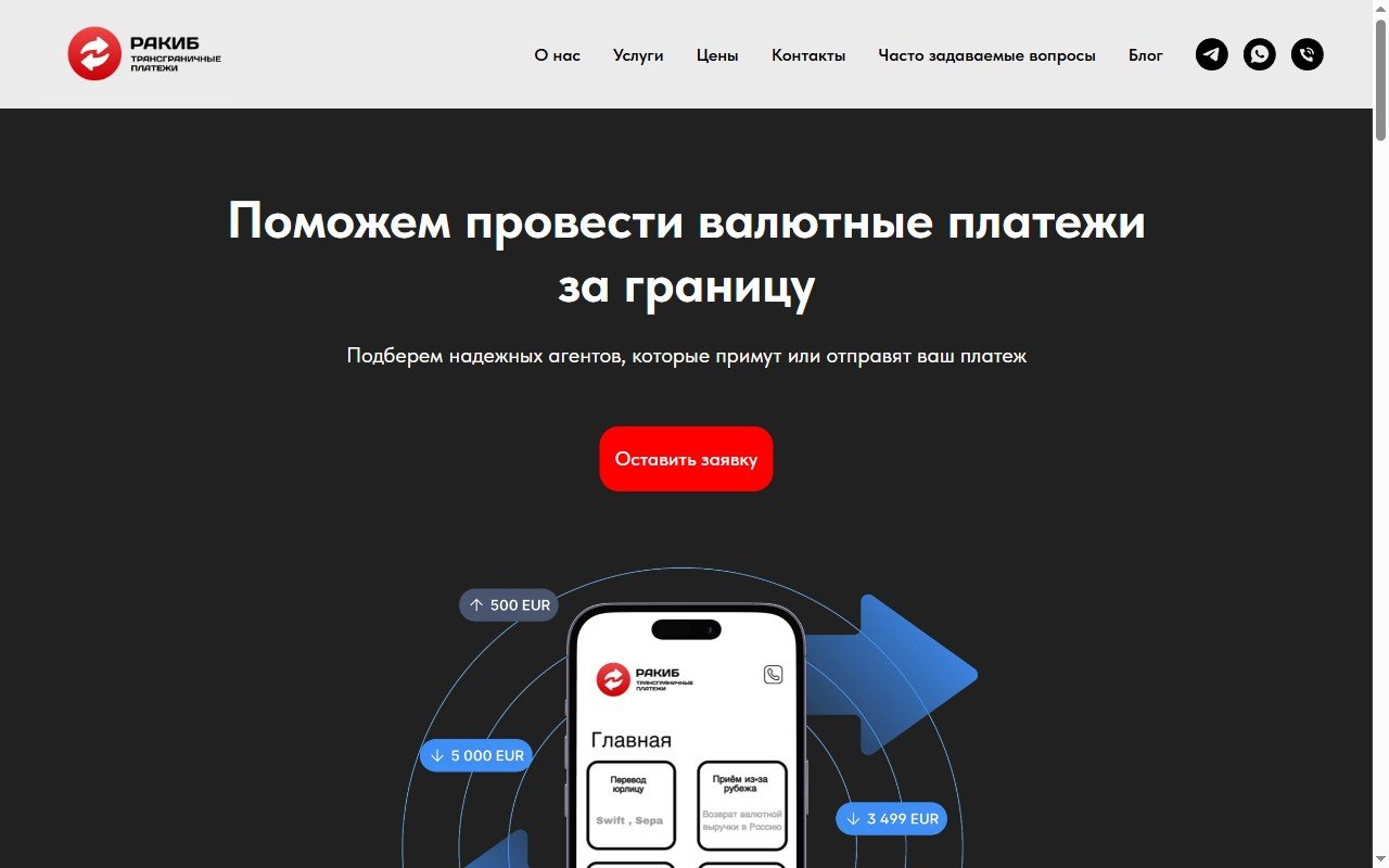
Designing trust around a complicated financial service.
- Client
- MoneyPort
- Industry
- Financial services, B2B
- Scope
- Structure, design, build
- Platform
- Tilda
- Role
- Everything end to end
Project scope:5 settlement currencies: USD, EUR, CNY, AED, crypto4 process steps — from request to closing act8 objections answered in the FAQ1 primary conversion path
The problem
Cross-border B2B payments are a service where the client risks both money and deadlines. The page had to answer the questions an importer actually arrives with: what exactly does the service do, does it fit my case, which currencies are supported, how does the process work — and why should I trust these people.
And the service is genuinely complex: agent agreements, fixed exchange rates, closing documents. Explaining it in plain language mattered more than making it look pretty.
Why users hesitated
- Trust over creativity
- Transparent process and fees
- An obvious next step at every point
- Plain language instead of financial jargon
Information architecture and the path to a request
An agent-based payment scheme is hard to grasp from one screen.
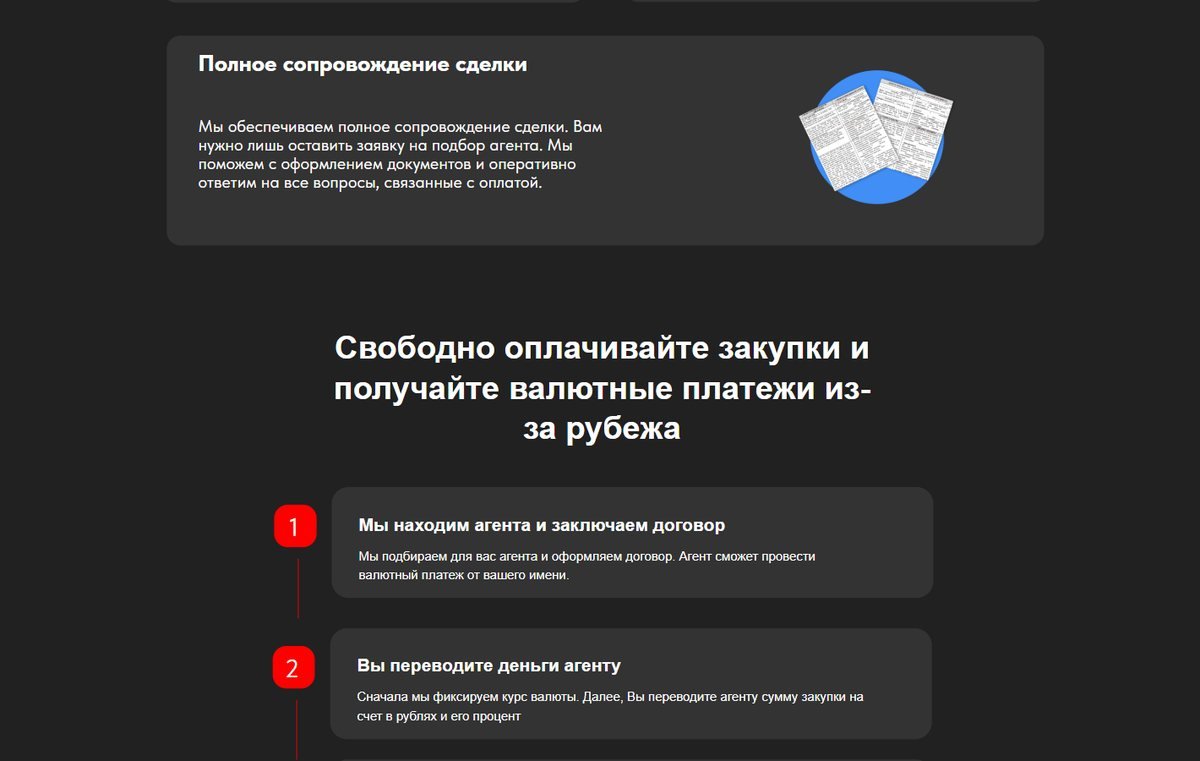
The page follows Understand → Trust → Process → Objections → Contact: currencies and directions first, then the deal in 4 steps.
A financial service with hidden pricing looks suspicious by default.
Fees are published right on the page — central-bank rate + 2% for agent contracts, XE.com + 0.5% for SWIFT/SEPA — before the form, not "on request".
Several equal buttons scatter attention on a page like this.
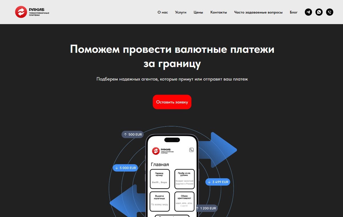
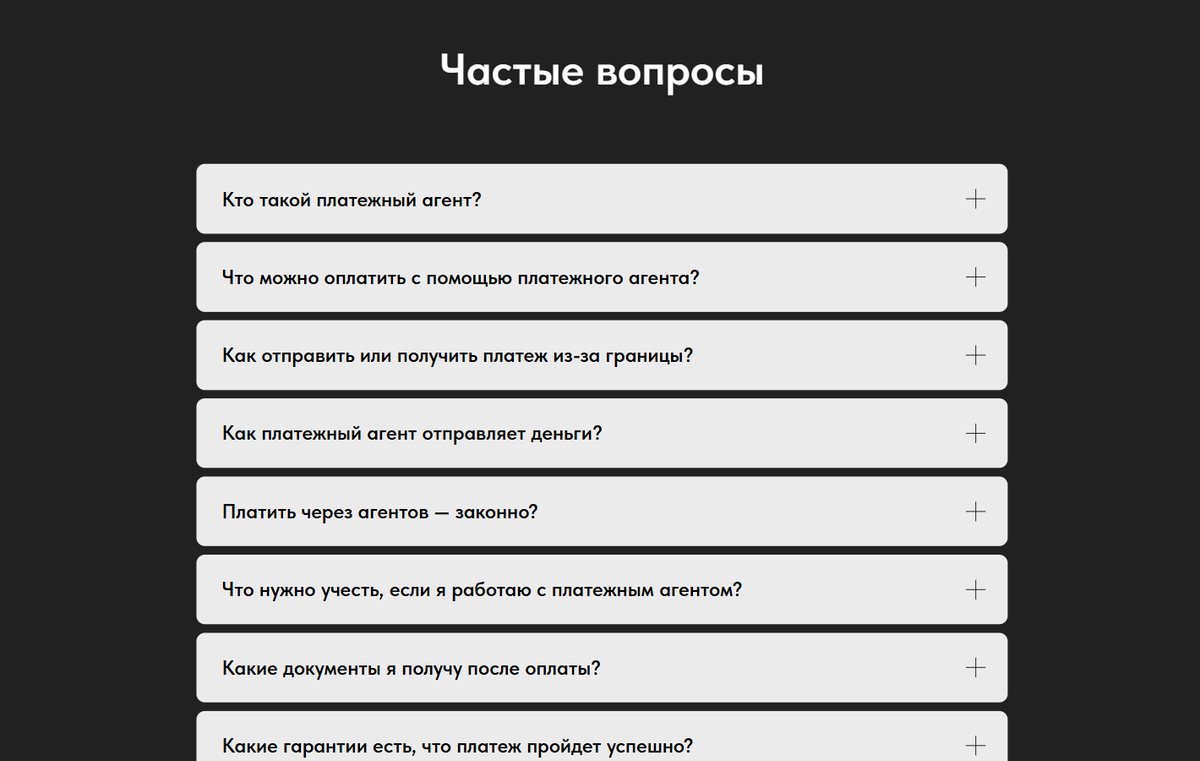
One primary path — a callback request — and the FAQ removes the remaining doubts on the way there.
Key decisions
A 4-step process block
Each step answers a specific fear: the rate is fixed, there's a contract, there's a closing act.
FAQ as objection handling
From "what is a payment agent" to the honest limits of the service.
Fees on the page
Transparency filters out mismatched leads before they write.
One primary CTA
Instead of several competing actions.
Project screens
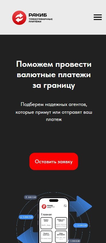
The result
The page became one consistent scenario:
- one primary action instead of several competing ones
- fees and terms visible before the form is sent
- the key objections answered before the enquiry
- a clear path from first contact with the service to a request
The client didn't share conversion data, so the result describes the change in the user scenario — not a growth number.
View live siteWorking on something similar?
Tell me about the project and I'll suggest a practical way to build it, a platform and a timeline.
Start a projectRelated projects
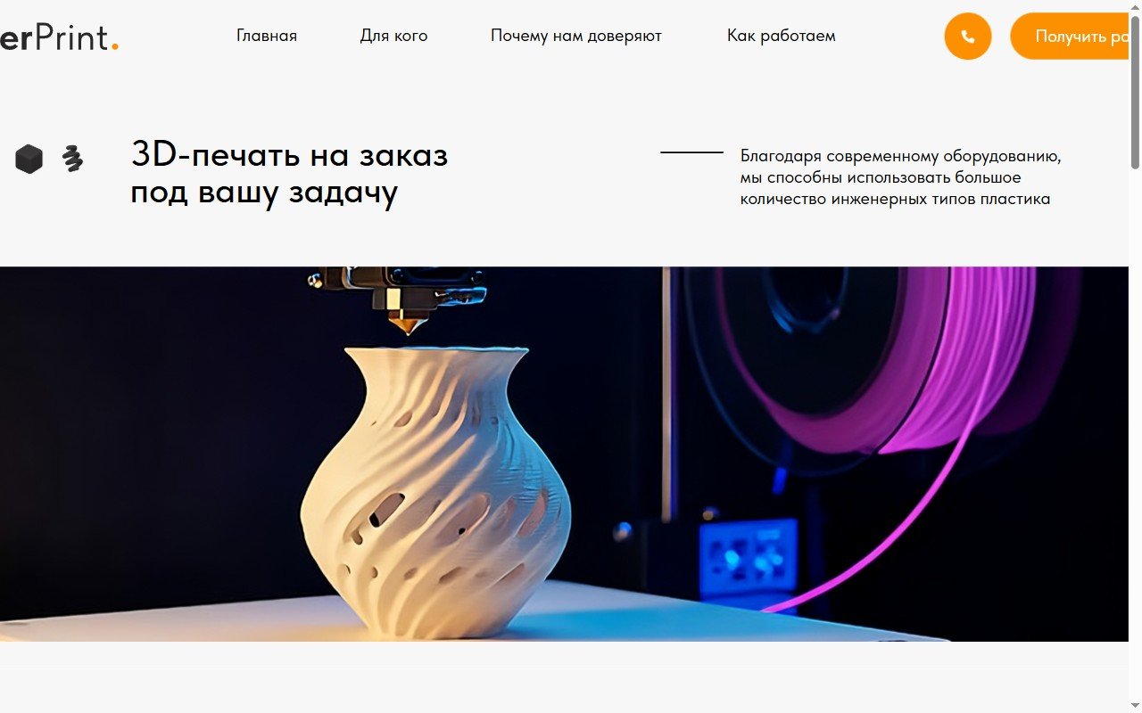
SEVERPRINT — 3D Printing Service
Landing page for a made-to-order 3D printing service — prototyping and small production runs, with a sticky nav, anchor navigation between sections, a materials and use-case breakdown, and a quote request form.
View project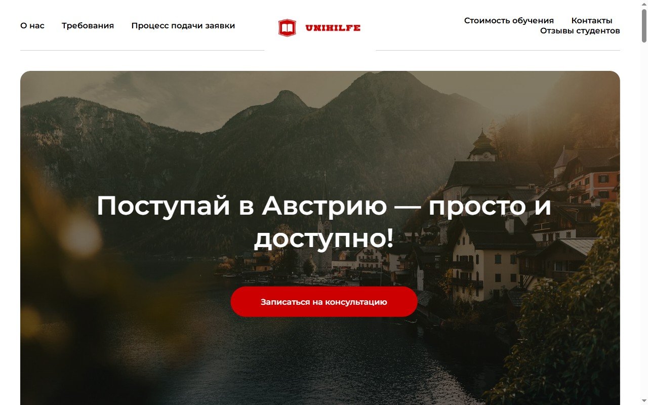
UniHilfe — Study in Austria
Lead-generation page for a consultancy helping students apply to Austrian universities — application walkthrough, support scope from picking a university through to finding housing, pricing position against competitors, and a free-consultation booking form.
View project